Exploratory Model Analysis: A Brief Demo
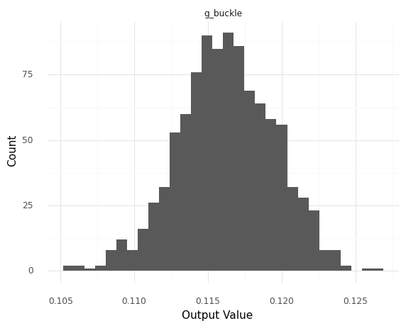 Image credit: Zachary del Rosario
Exploratory Model Analysis: A Demo
When studying a dataset we use an exploratory analysis to gather an initial impression of the data. We can use a similar approach when studying a model. The grama python package is designed to support the analysis of models, including exploratory model analysis (EMA). What follows is a short demonstration of EMA using grama.
Setup
The grama package is a python toolkit for analyzing models; you can install it from PyPI with the terminal command pip install py-grama. Let’s load grama to get started.
import grama as gr
DF = gr.Intention()
Grama comes with a variety of built-in models. As an example, let’s look at a model for the buckling behavior of a flat plate. The following code instantiates a grama model of a plate under buckling (compressive) load.
from grama.models import make_plate_buckle
md_plate = make_plate_buckle()
Top-level summary
When exploring a dataset one of the most important first-steps is to inspect top-level summaries, such as the five-number summary. In EMA there is an analogue sense of top-level summary. Important summary information includes the input and output details, which grama makes easily accessible:
## Return a top-level summary of the model
md_plate
model: Plate Buckling

  inputs:
    var_det:
      w: [6, 18]
      L: [0.00064, 0.00256]
      h: [6, 18]
      t: [0.03, 0.12]

    var_rand:
      E: (+0) norm, {'loc': 10344.736842105263, 'scale': 258.7392188662194}
      mu: (+0) beta, {'a': 1.0039090847355956, 'b': 0.8622625745559566, 'loc': 0.30940527668994305, 'scale': 0.021594723310056966}

    copula:
      Gaussian copula with correlations:
  var1 var2      corr
0   mu    E  0.371244

  functions:
      limit state: ['t', 'h', 'w', 'E', 'mu', 'L'] -> ['g_buckle']
Some key observations from this summary:
md_platehas four deterministic variables:t, L, w, h- the model has two random variables
E, muEis normally distributedmuis distributed as a beta distributionEandmuhave a positive correlation
- the model maps all of its inputs to a single output
g_buckle- this is a limit state; a function where $g > 0$ corresponds to safe operation
Model Context
While summaries are useful for understanding a model, they are not sufficient for a full understanding. One of the additional pieces of information we need to interpret a model is its context, including what its inputs and outputs represent. This gives us the knowledge we need to understand the consequences of the observations we make. Context is specific to a model, and often not purely mathematical.
There is a lot of context we could discuss with the buckling plate model, but we’ll focus on one important fact: Larger values of g_buckle indicate a safer plate, while smaller values of g_buckle are more dangerous. A value of g_buckle == 0 is barely unsafe.
Visual Summaries
For something like a buckling plate, we could inspect the governing equation in order to learn about the model’s behavior. An alternative would be to use an EMA approach using visuals. A visual approach generalizes to cases where we don’t have an explicit equation, and provides us with techniques we can apply to many different models.
Let’s take a look at some visual summaries of the model’s behavior.
Input Effects: Sinew Plots
First, let’s use a
sinew plot to study how the inputs affect the output. Note that since md_plate contains a great deal of information, we can generate a dataset and visualize the results in just a few lines of code.
(
    md_plate
    # Evaluate the model to generate a dataset
    >> gr.ev_sinews(df_det="swp")
    # Visualize the data
    >> gr.pt_auto()
)
Calling plot_sinew_outputs....
<ggplot: (8780269552113)>
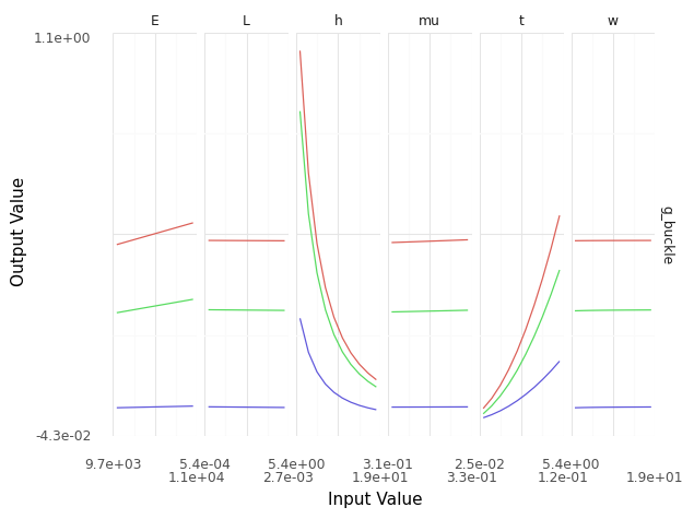
Every panel above shows a sweep in values for a single input, with all other inputs held to a fixed value. Thus, the collection of curves shows how each input can affect the output, and how those effects compare across the model inputs. For the buckling plate model, we can see:
- the inputs
E, L, mu, whave relatively little effect - increasing
hdecreasesg_buckle- This is the height of the plate; a taller plate buckles more easily.
- increasing
tincreasesg_buckle- This is the thickness of the plate; a thicker plate is harder to buckle.
We can better understand how a sinew plot is generated by visualizing the input values (not plotting any output values).
(
    md_plate
    # The `skip` keyword allows us to skip evaluating the model outputs
    >> gr.ev_sinews(df_det="swp", skip=True)
    >> gr.pt_auto()
)
Design runtime estimates unavailable; model has no timing data.
Calling plot_sinew_inputs....


Warning: Matplotlib is currently using module://ipykernel.pylab.backend_inline, which is a non-GUI backend, so cannot show the figure.
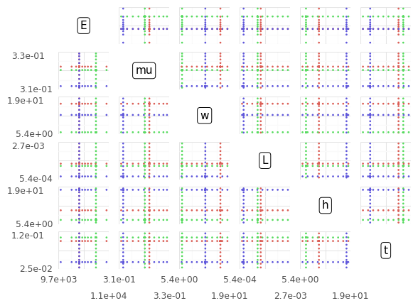
This is a scatterplot matrix of all the input values: Notice that we see parallel lines across each panel. These lines are generated by choosing a set of random points within the input space, then sweeping along each of the input variables. The visual we saw before uses points along each input sweep, along with the corresponding output value.
Sinew plots help us understand how the model outputs behave with respect to the inputs. The next analysis type will help us understand uncertainties associated with the model.
Uncertainties: Monte Carlo
From the top-level summary, we saw that the model has two random variables. We can use Monte Carlo to help understand how these uncertainties affect the model results. First, we use a skip=True analysis to inspect how the inputs behave.
(
    md_plate
    >> gr.ev_monte_carlo(n=1e3, df_det="nom", skip=True)
    >> gr.pt_auto()
)
eval_monte_carlo() is rounding n...
Design runtime estimates unavailable; model has no timing data.
Calling plot_scattermat....


Warning: Matplotlib is currently using module://ipykernel.pylab.backend_inline, which is a non-GUI backend, so cannot show the figure.
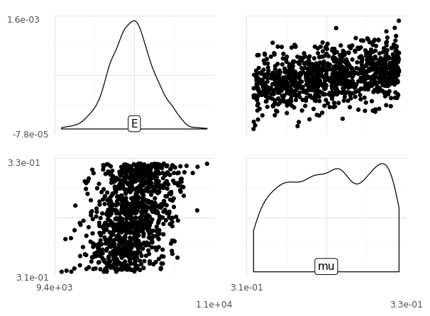
Here we can see that E has a normal shape, mu has a flatter shape (a beta distribution), and the two variables are positively correlated.
Next, we can remove the skip keyword to check how the uncertainty in the inputs generates uncertainty in the model outputs.
(
    md_plate
    >> gr.ev_monte_carlo(n=1e3, df_det="nom")
    >> gr.pt_auto()
)
eval_monte_carlo() is rounding n...
Calling plot_hists....

<ggplot: (8780268977312)>
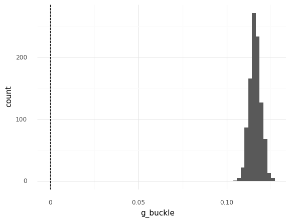
This shows us that the g_buckle output is not certain. However, comparing the width of the distribution (about $\pm 0.01$) to its mean (about $0.115$), we can see that the variability is not large compared to the scale of g_buckle.
While grama provides the convenient gr.pt_auto() utility, we can construct a more specific plot to encode things like the model context. Remember that the value g_buckle == 0 is special; we can construct a plot that highlights this special value. Grama imports the
plotnine package for visualization.
(
    md_plate
    >> gr.ev_monte_carlo(n=1e3, df_det="nom")
    >> gr.ggplot(gr.aes("g_buckle"))
    + gr.geom_histogram(bins=60)
    + gr.geom_vline(xintercept=0, linetype="dashed")
    + gr.theme_minimal()
)
eval_monte_carlo() is rounding n...
<ggplot: (8780268084923)>
This version of the plot shows that the distribution of g_buckle is very well separated from the zero threshold: This shows us that the model suggests a very safe plate that is not in danger of buckling.
Zachary del Rosario
Assistant Professor of Engineering and Applied Statistics
Empowering scientists and engineers to reason under uncertainty